CLOUDStudy
Student Learning and Productivity Platform
Project Background
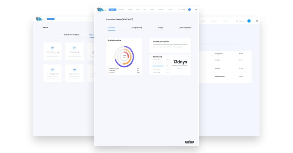
CLOUDstudy is a Student Learning and Productivity platform designed to help students complete their regular learning activities effortlessly, such as downloading and submitting assignments, adding contacts and sending messages, displaying and accessing their resources, updating their profiles, scheduling tasks, and receiving updates of upcoming events and deadlines.
Note: This was a college project and I am not affiliated to any learning performance organisation
Role
I was the UX/UI Designer. I managed all aspects of the project, from the initial user research and ideation, through to prototyping and user testing and content design.
Duration
8 Weeks. January 2020 - February 2020
Team
Ruairi Murphy- Product Owner,
Stakeholder Interview
I started by conducting the stakeholder interview. This helped the team to gain an understanding of the scope of the project from the business angle.
What was Discovered
The main points we derived from the stakeholders' interview were to:
✦ Provide key functionality for the student (Assignment Submission, Access to Notes, Peer & Lecturer Interaction).
✦ Increase student engagement with the application, as studies show that higher engagement leads to better performance.
✦ Build an accessible and secure framework, with a specific emphasis on the educational needs of students.
✦ Replace the current Moodle system.
✦ To promote user-centred design by adding more functions to make the application more usable and useful.
Competitor Audit
I then interviewed ten professionals within different career levels in a bid to gain insight into their experiences with legal websites and their usability.
What was discovered
✦ User Interface
Both competitors interface was difficult to use and visually unappealing. Reviews on student blogs suggest their difficulty to install and use. However, There was a similarity with the Navbar where information such as courses was visible and easily accessible.
✦ Course Content
Both competitors lack real-time content. Students were not able to gain real-time information, e.g course content during a live class. Students usually had to wait for a lecturer to upload course content which might take several days to become available.




Qualitative Research
I then proceeded to conduct the qualitative research where I interviewed over ten students of which nine were students across different universities in Ireland and a recent graduate from Switzerland.
What was discovered
✦ The majority of the respondent complained about the navigation on their current virtual learning platform (VLE)
✦ There were complains on the number of times they were logged out by the application
✦ The majority of respondents stated that their present VLE lacked a personal touch.
✦ Most of the respondents complained about memorability and learnability issues on their current VLE.
Target Audience -(18-35)
The information obtained from the quantitative study prompted the identification of a group of potential users for further analysis in the form of open-ended user interview questions.
Our target audience falls within the 18-35 age range who are current third level students or graduated in the last 6 months.
Problem Statement
Third level students are seeking a virtual learning application that enables them to achieve overall academic excellence.
Empathy Mapping
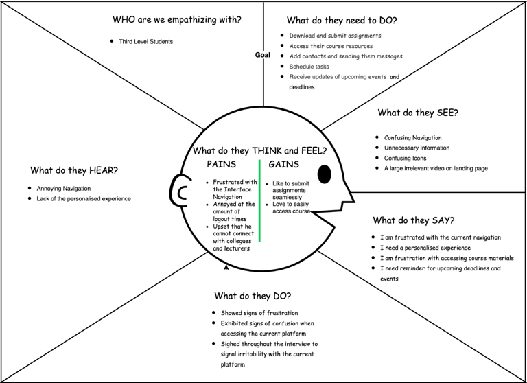
During this stage, I started with an empathy mapping exercise with two other designers. Our goal was to organise the data gathered from the research stage into clear insights that could be used to improve the product and avoid possible pitfalls.
What was discovered
Four main barriers were recurrent across the respondent:
✦ The navigation of their current virtual learning platform(VLE)
✦ The number of times the application logged them out
✦ Most of the respondents complained about their current VLE lacking a personal touch
✦ Most of the respondents complained about memorability and learnability issues on their current VLE.
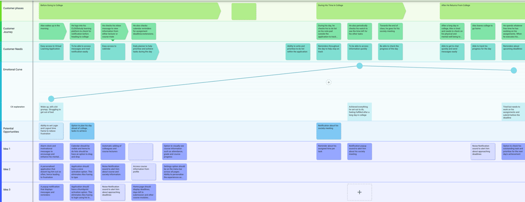
Customer Journey Mapping
I proceeded to conduct the customer journey map which helped the team access the users' experience at every touchpoint. This helped reveal hidden pitfalls and early identification which were iterated on and validate by the users.
Persona
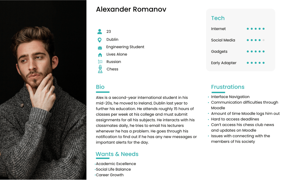
At this stage, a persona was created based on the interviews conducted. The team and I reflected on the persona throughout the entire product development process.
Pain Points
✦ Alex expressed frustration with the communication difficulties he experiences while using Moodle
✦ The number of times Moodle logged him out
✦ He cannot access news and updates from his chess club through Moodle
Mood Board
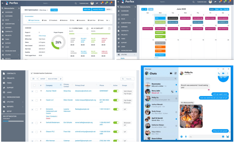
The team drew some inspiration from top apps that were used/familiar to our target audience. Applications like moodle, WhatsApp, Perfex, calendar.
Information Architecture
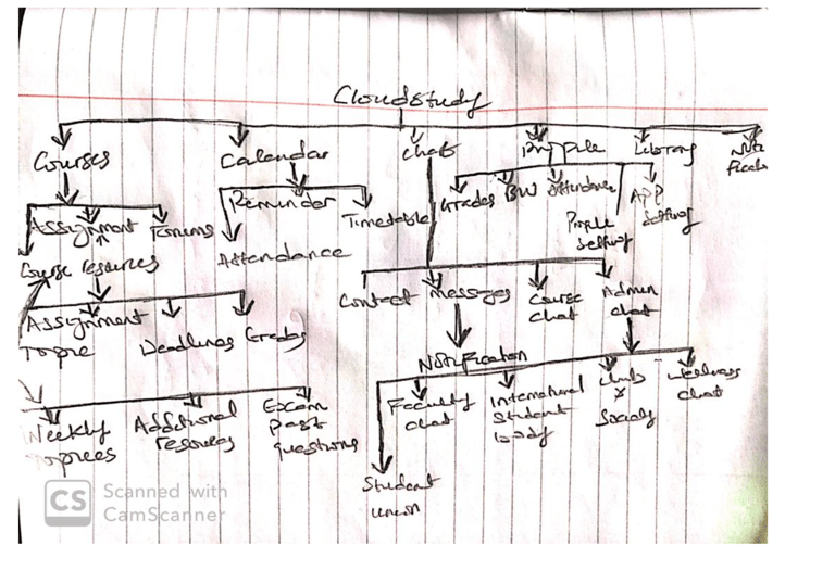
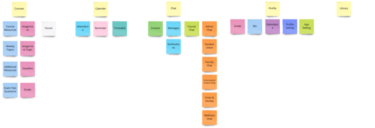
I did a rough sketch with pen and paper on how the IA would look. This assisted in the visualisation of the physical structure of the website content. I made some adjustments and the final design developed using Adobe XD.
To ensure that the iterated information architecture(sitemap) matched the mental model of our users, I conducted a card sorting exercise. After the card sorting exercise, necessary adjustments were made to ensure that the website is as intuitive as possible.
Low Fidelity Wireframes
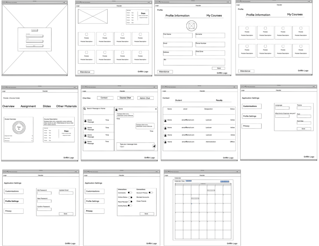
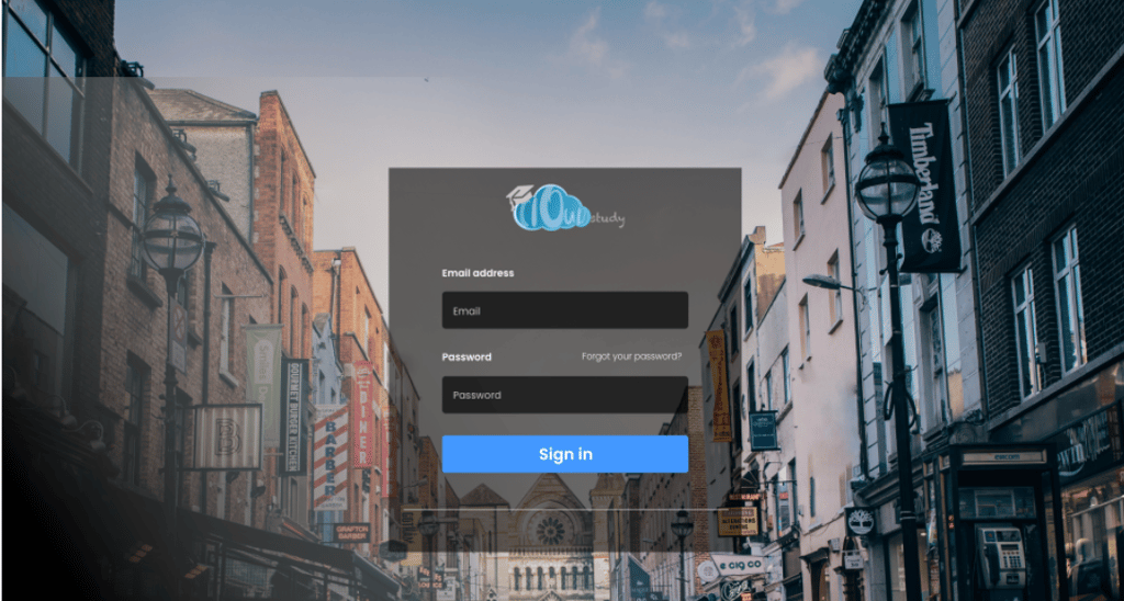
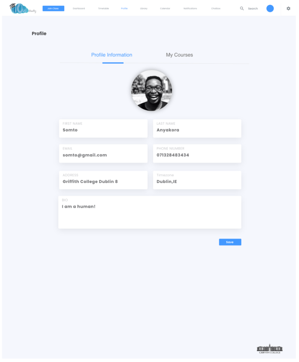
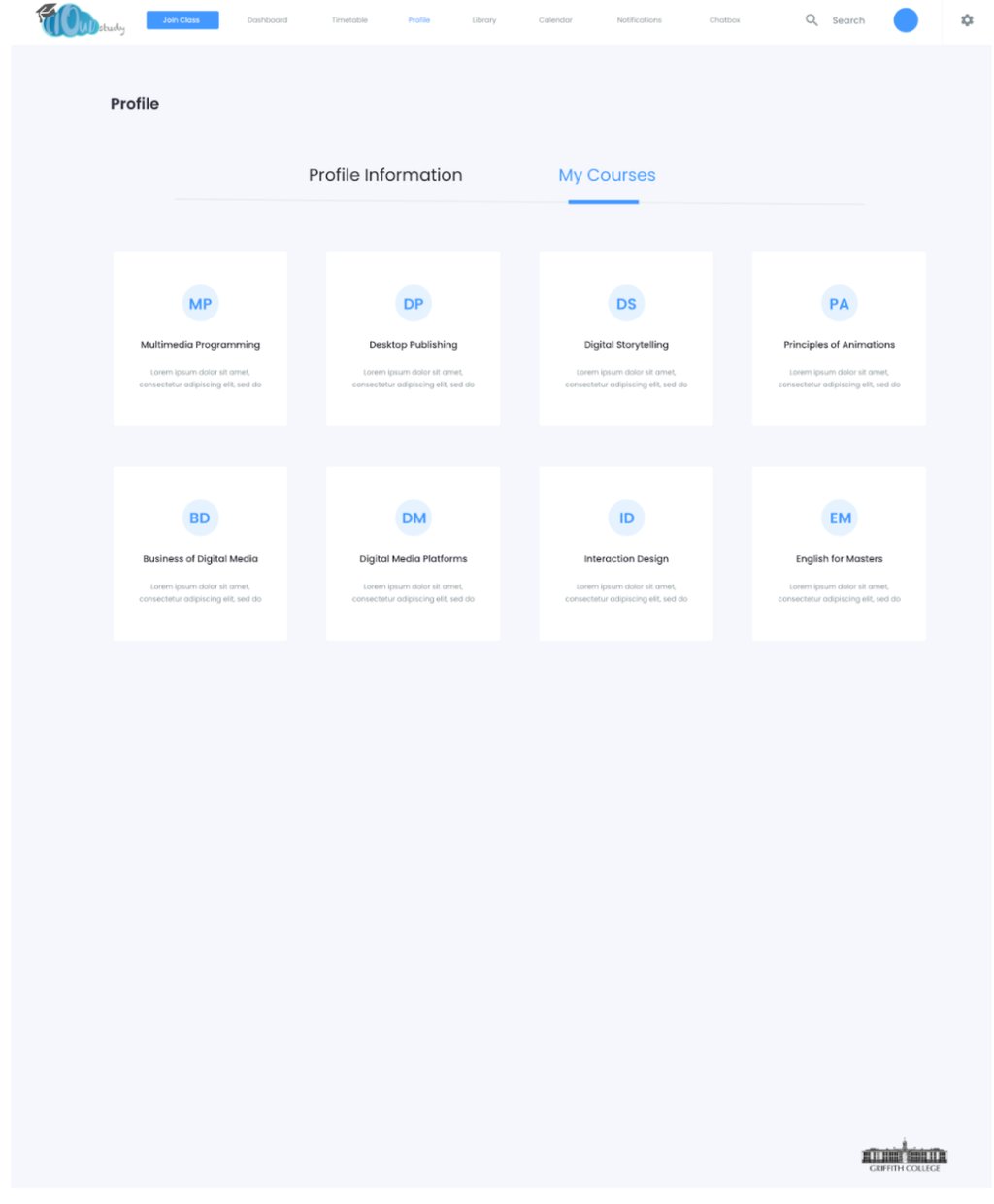
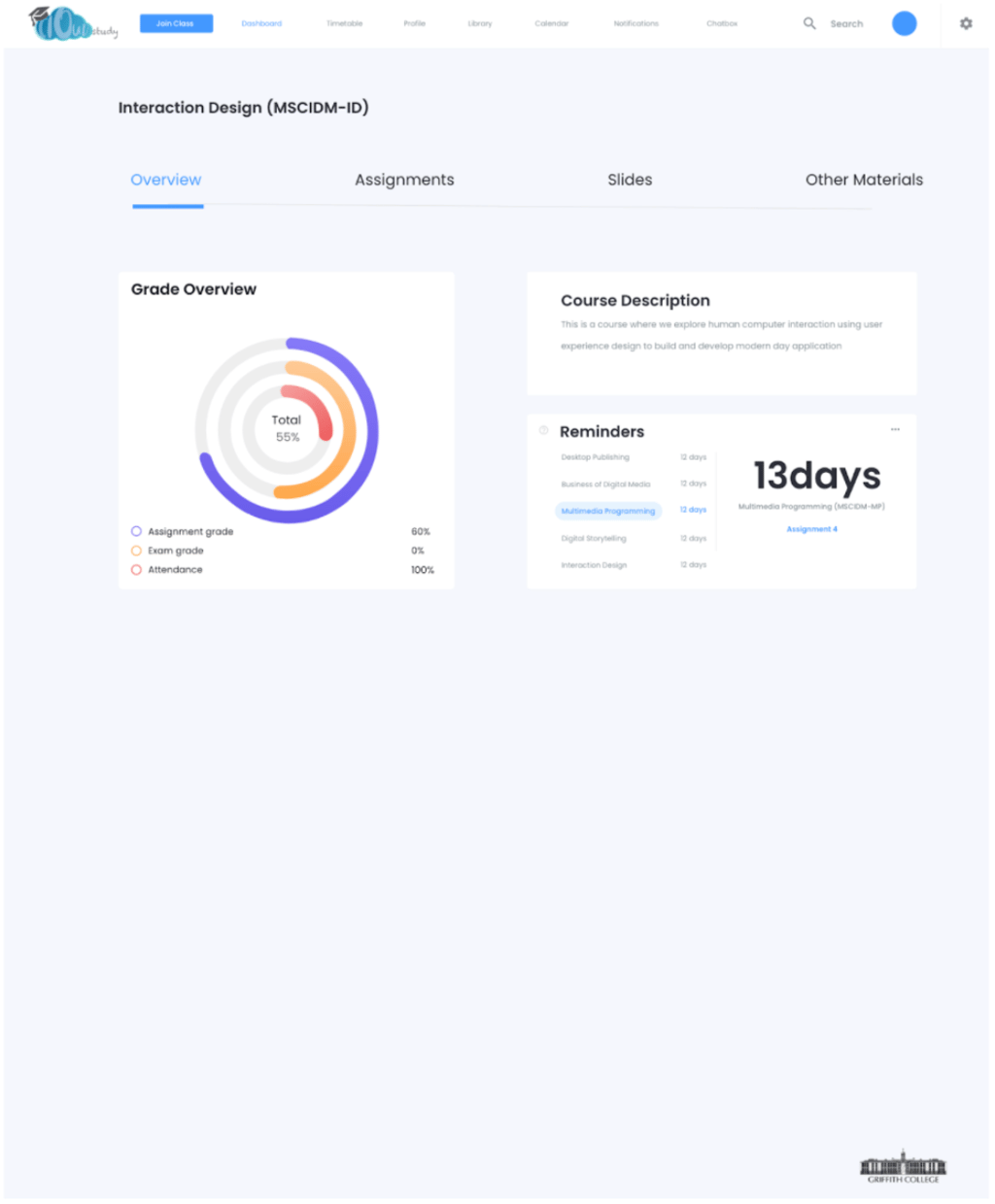
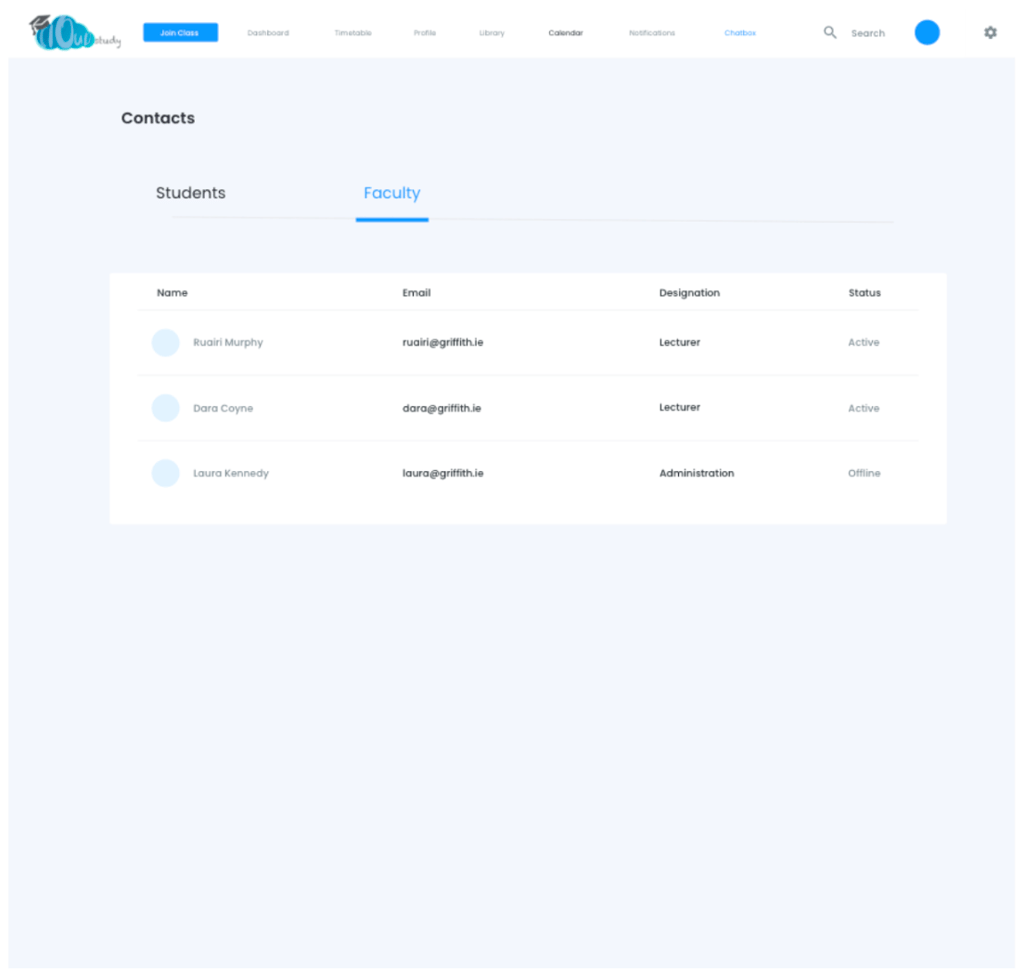
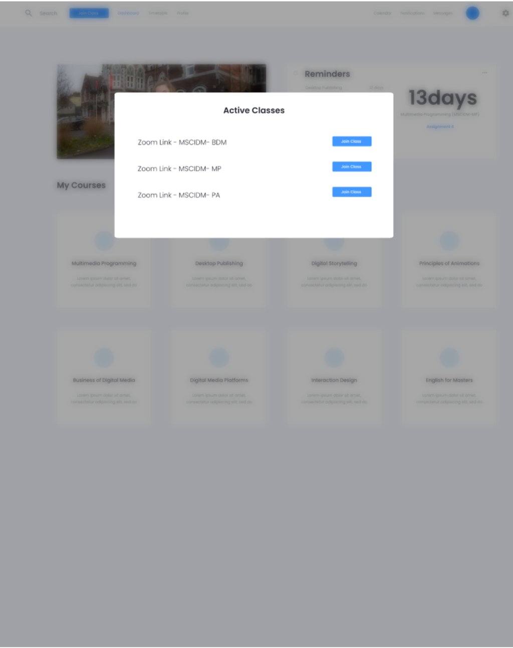
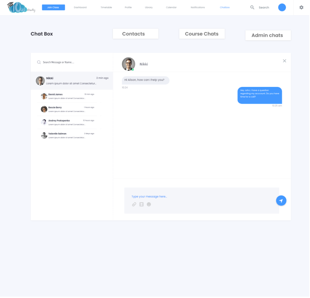
I started this process by creating a low-fidelity wireframe on Balsamiq for testing purposes. I used the insights gathered from our users for the initial design. The wireframe guided me during the design process. After conducting the necessary testing, I designed the high fidelity version on Adobe Xd for more usability testing.
High Fidelity Wireframes
User Flow Diagram
At this stage, the team and I decided to conduct a user flow diagram in a bid to test the redesigned information architecture to see if a solution to the problem statement was achieved and also to reveal hidden pitfalls.


Pain Points Solved
Pain Point 1: Students couldn't access live classes
Solution 1: There was a feature that enabled students to attend live classes
Pain Point 2: The need to communicate with non-academic staffs e.g chess club members
Solution 2: There was a chat box feature where students could communicate with both academic and non-academic staffs
Pain Point 3: Confusing and non-visually appealing Interface
Solution 3: The interface was clear and intuitive enough and required little to no learnability and memorability from the users.


Learning Experience
This was a difficult yet gratifying project. During this case study, especially during the research phase, I learned a lot. The quantity and quality of useful ideas discovered during usability tests aided the product later on, and I improved my moderating approach to get the most out of the participants.
There is room for improvements with the redesigned website. However, I am glad to kick-start on resolving some problems, creating opportunities to leverage the user experience, and improve customer relationship. The learning curve is that user testing is a powerful method to find users' problems and needs.
