UUBO
Redesign the company website
Objective
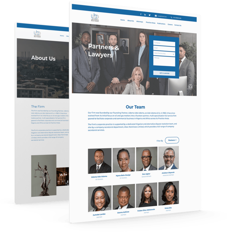
The objective of this project is to redesign a legal website to improve the user experience, streamline navigation, and enhance the accessibility and relevance of information for clients seeking legal services. The primary focus is to simplify the user journey, eliminate unnecessary legal complexities, and ensure that clients can easily find the information they need without feeling overwhelmed.
Role
I was the UX/UI Designer. I managed all aspects of the project, from the initial user research and ideation, through to prototyping and user testing and content design.
Duration
10 Weeks. June 2020 - August 2020
Team
Innocent Freddy- Product Owner, Daniel Smith- Engineer
Research
I started by conducting a stakeholder interview with the managing director. Dan gave great insights into the scope of work their organisation does as well as their business needs and clients expectations.
What I Discovered
There were two main points derived from the stakeholders' interview, which were:
1. The main business challenge was creating an interface that would be welcoming and easy to use for people seeking legal assistance across different legal proficiencies
2. A website that will attract corporate alliances who are interested in the services they have to offer and contribute to the organisation.
Competitor Audit
After the stakeholder interview, I proceeded to the competitors' audit. During this stage, I looked into 3 competitors; Banwo& Ighodalo, Olaniwun Ajayi and Aluko & Oyebode.
What I Discovered
✦ User Interface: There was consistency in layout across the different competitor, There were many notable features, including a clean and responsive UI. However, there were some repetitive content as well as inconsistency with text and icons.
Reducing the number of clicks and web pages that users have to go through to find essential information became a goal for this redesign.
✦ Content Design: Most of the copy was either too long or too "legal". There were terminologies used that might not have been understandable to non-lawyers and that is discouraging to first-time clients.






Qualitative Interview
I proceeded to conduct a focus group with 5 clients within different sub areas( new clients, existing client, personnels from big corporations and small corporation) of the firm, where i observed how they interacted with the existing website and gain understanding into their pain points and frustrations they were having with the website.
What I discovered
Complex Legal Terminology: The existing website contains excessive legal terminology that hinders users' understanding and ability to find relevant information. Simplifying language and presenting information in a clear and concise manner is essential. Users preferred to interact with websites that are easy to understand and use. Terms in relations to value, usability, adaptability and desirability were consistent across the interviewees.
Information Overload: The website currently has an overwhelming amount of publications and content, making it difficult for users to locate the specific information they require. Streamlining and categorizing content will help users find what they need quickly and efficiently.
Navigation and User Flow: The current website lacks intuitive navigation, resulting in a disjointed user experience. Improving the navigation structure, implementing clear pathways, and optimizing search functionality will enhance usability and guide users to their desired information.
Visual Design and Branding: The website's visual design and branding elements may not effectively communicate trust, professionalism, and reliability. Enhancing the aesthetics, typography, color scheme, and overall visual hierarchy will contribute to a more engaging and credible user experience.
Problem Statement
Clients of a legal website are struggling to find relevant information due to the overwhelming presence of unnecessary legal terms and publications, negatively impacting their user experience and impeding their ability to access the information they need efficiently.
Affinity Diagram
During the affinity workshop, some major themes were noticed, the users' concerns were categorised under the following themes: "behaviour, mismatched mental model, pain points, bad UI and positive features".
✦ Three out of five users had concerns with the navigation of the website, especially on the contact us page. It was not straightforward and had to scroll down to find information about a practitioner.
✦ Users were apprehensive when engaging with the interface because of the lack of immediate and visible accreditation of their services.
✦ It was discovered that users were more likely to perform an action such as contact the office or an attorney if the navigation was simple and easy to access
✦ The contact page is also broken and displayed the "google's 404 error code".


Persona
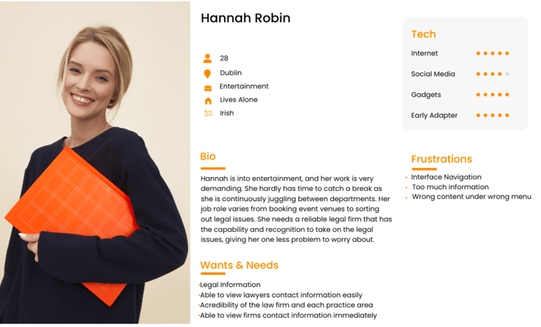
At this stage, I created a user persona based on our earlier research. It was highly important to have a solid idea of who our user was to reference throughout the process.
Pain Points
✦ Interface Navigation
✦ Wrong content under wrong menu
✦ Too much legal terms, hard to follow and understand
✦ Inability to quickly contact a practitioner
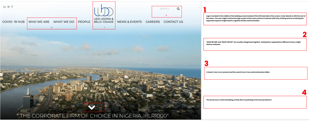
Heuristic Evaluation
The initial website was evaluated using Nielsen's 10 Heuristics for User Interface design.
What I Discovered
After the evaluation, significant usability and design errors were identified such as:
✦ Clustered navigation
✦ Difficult to see the call to action buttons
✦ Inconsistency between pages
✦ Important information repeated
✦ lack of consistency across the website.
A focus on information architecture and visual design was used to simplify significant parts of the interface
Task Flow
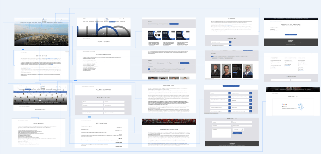
I then proceeded to analyse the task flow of the company's user interface and identify potential design errors and avoid them in the redesign.
What I Discovered
✦ The main navigation has some irrelevant options such has an alumni network.
✦ There is much information for the users to process and this can be overwhelming for the user
✦ There is a lack of content strategy as there are several " text" even in places where visuals would have made a massive difference to the overall user experience
Card Sorting
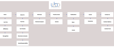
I ran a closed card sorting session, I used this technique to determine which functionalities of the dashboard should stay, be relocated or be eliminated based on our platform’s information architecture and how much value it was adding on our dashboard.
After the card sorting session with the user, below were some of the discoveries
✦ The user was confused about what some menus indicated
✦ The content strategy was also not effective and only confused the user.
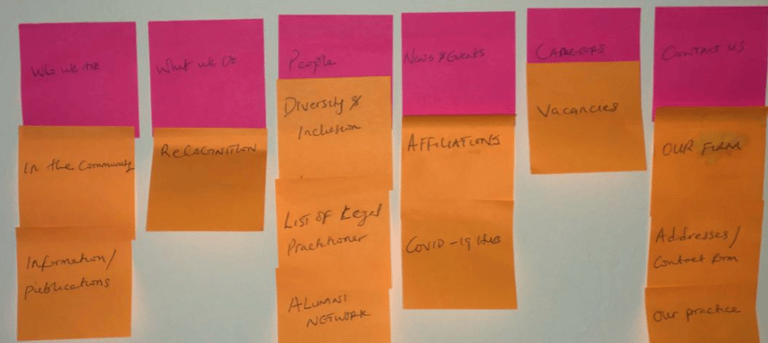

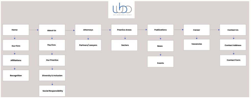
After the initial card sorting exercise, I conducted further research and iterations and was able to generate new menu names that were clear and concise.
✦The information that remained consistent across both interfaces( initial and redesigned) was the "careers" and "contact us" menu
✦The following menus "who we are" and "what we do" was changed to "About Us" and "Practice Areas".
✦There was a redundant section "alumni network", which in no way benefits the users.
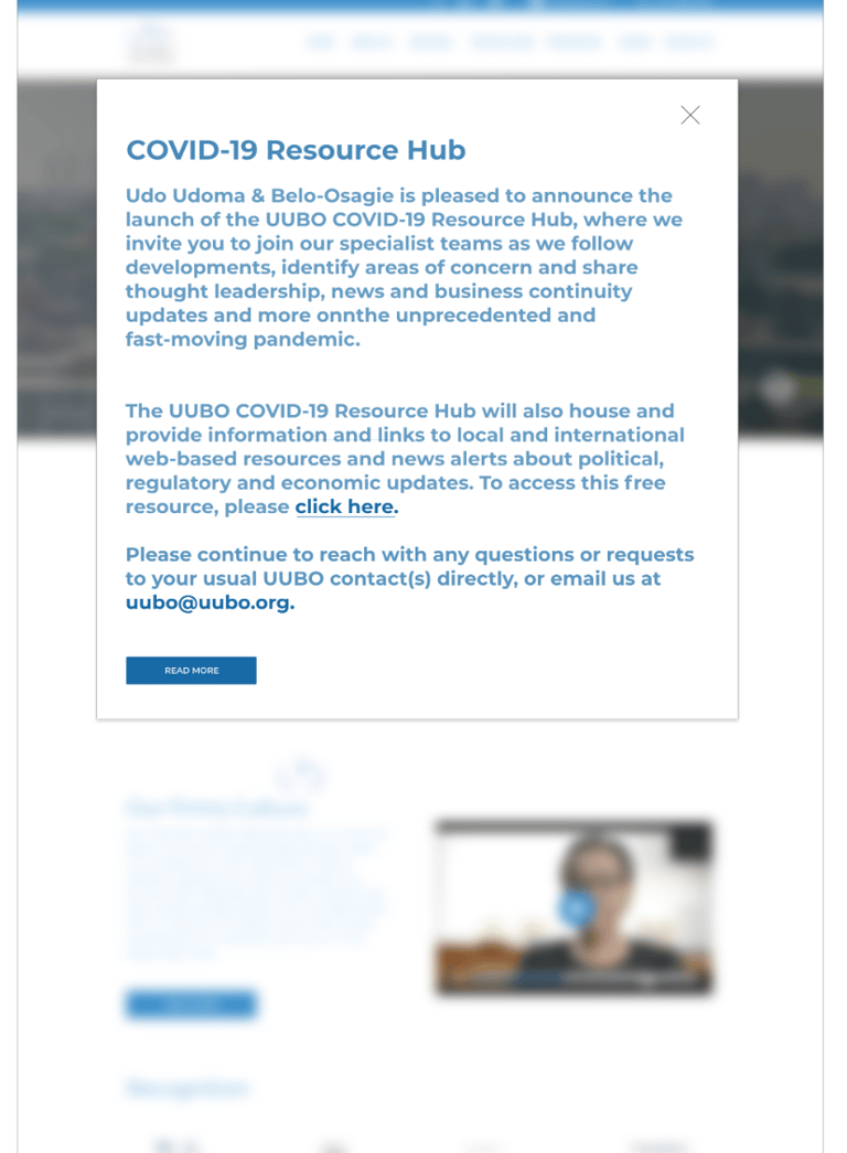
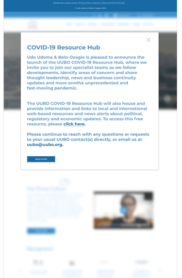
✦The COVID- 19 Hub will be a pop up( modal box), instead of a menu. I conducted a follow-up card sorting exercise to validate the new information architecture. The user was able to participate in the exercise with little to no supervision.
Initial Card Sorting Exercise
Iterated Card Sorting Exercise
Task Analysis
I proceeded to conduct a task analysis to see how the interface has reduced cognitive load for the users. Using Larry Marine's s task analysis diagram annotation, I conducted a task analysis to describe a "get a lawyer scenario" using the initial website.
✦Green represents the actions that users need to do.
✦Yellow represents a step the system can do.
✦Purple represents objects, tools, or information that the users need.
✦Orange represents questions or issues about the task
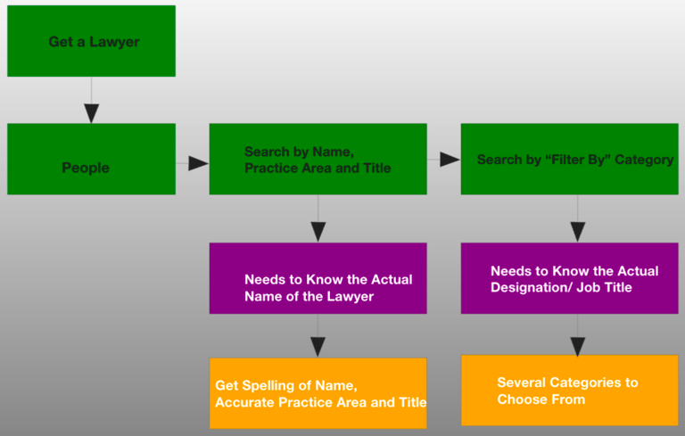
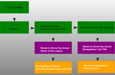
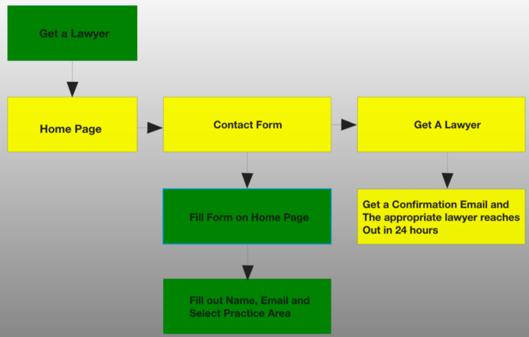
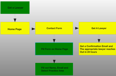
After the initial task analysis, i discovered that the website relied heavily on the users' input and actions without offering little to no help. I then did a redesign of how the task analysis should look.
The outcome of the re design was that there are fewer "green" and more "yellow" flows in the redesigned task analysis. The colour green denotes the steps that consumers must take. A step that the system can take is represented by yellow. This means that my team and I were successful in offloading tasks from users to the system, hence increasing their overall experience by making their lives easier.
Task Analysis
Task Analysis Redefined
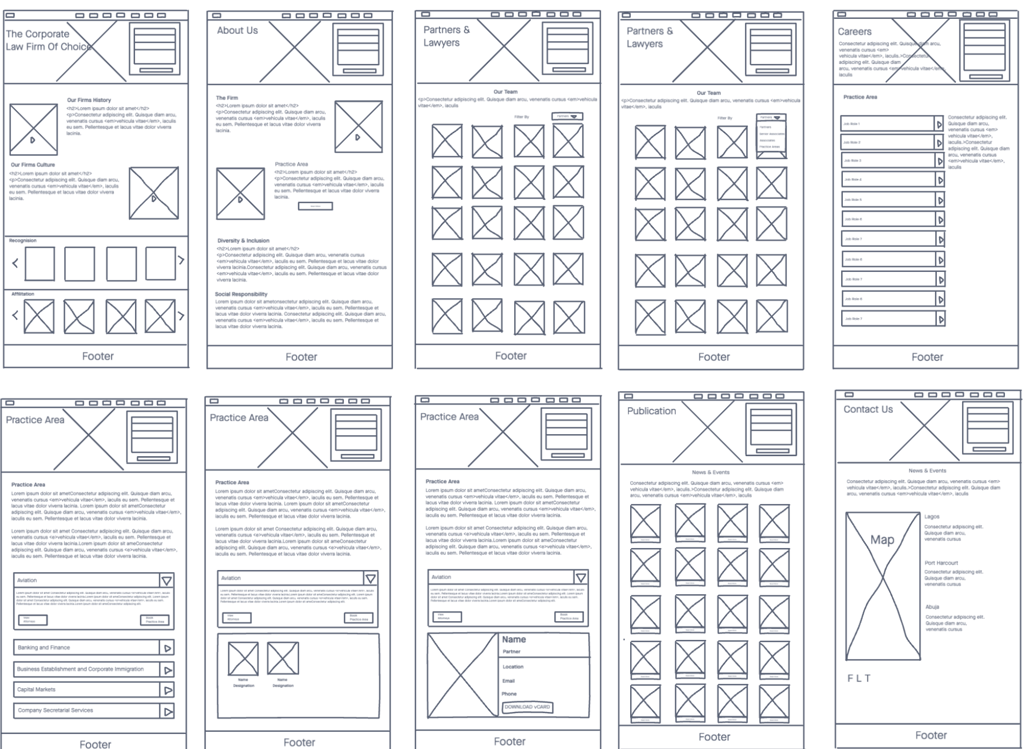
Low Fidelity Wireframes
I started this process by doing a rough sketch using pen and paper. After which I designed the the wireframe on Invision. The design was based on the insight gotten from the user research.
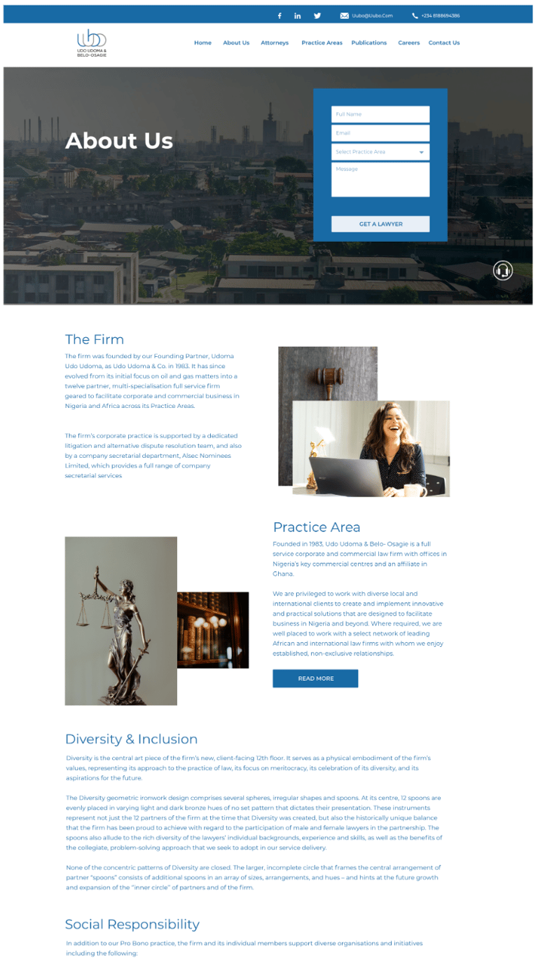
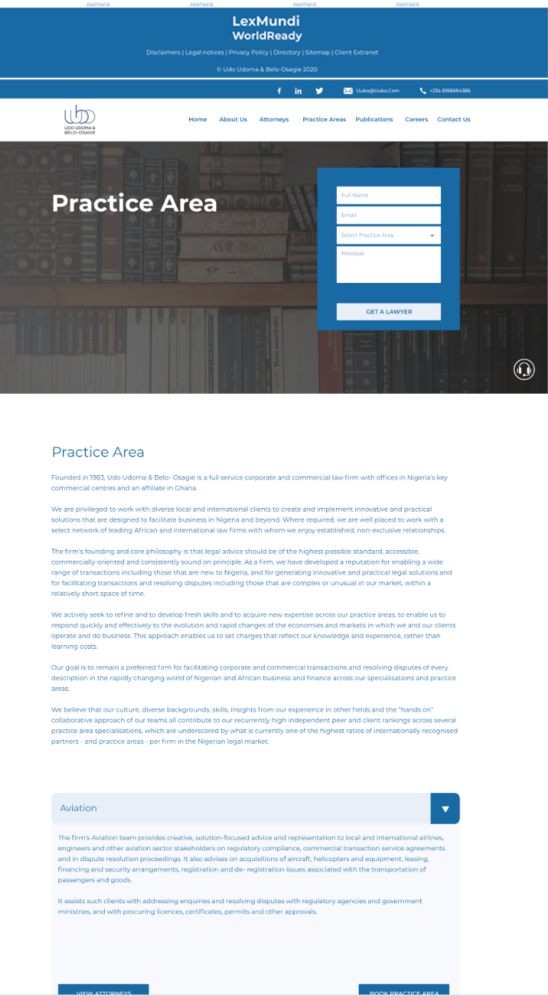
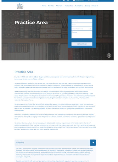
There is a contact form on every page that given the clients the freedom to get in touch with a lawyer quickly
User testing was conducted with the users to see if the design decision solves their problem.
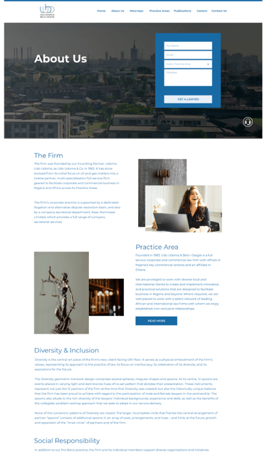
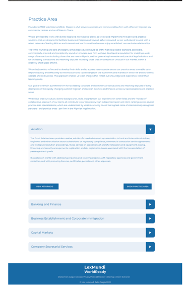
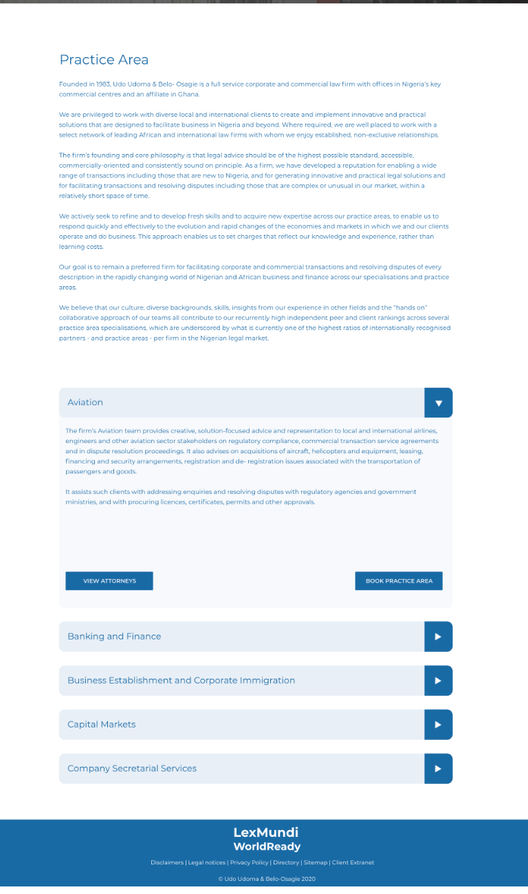
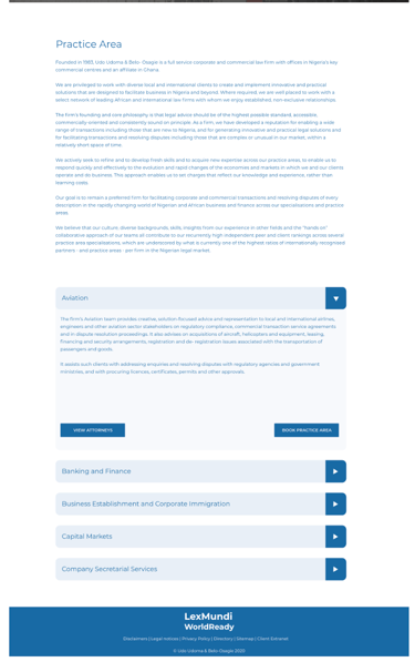
High Fidelity Wireframes - Figma

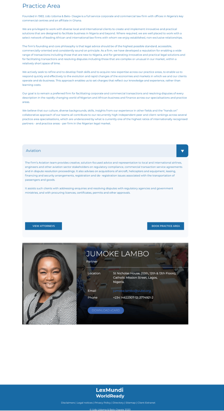
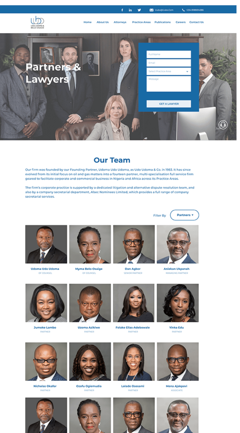

Color Scheme & Typography
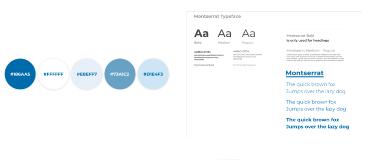
✦There was good use of negative space and high contrasting colours and a lot of white space.
✦The colour of the initial website was maintained
✦Most legal firms stick to the colour blue because blue is the colour of trust.
✦Blue induces calm and conveys tranquillity, serenity and peace.
✦The popular colour instils confidence and inspires feelings of trust, loyalty, integrity and responsibility, and these are the message most law firms are trying to convey
Pain Points Solved
Pain Point 1: The need to quickly contact a practitioner
Solution 1: A contact form was placed on every page
Pain Point 2: Too many legal terms, hard to follow and understand
Solution 2: Some text and menu names were either completely removed because of their redundancy or they were replaced with videos and appealing icons.
Pain Point 3: Lack of recognition and accreditation
Solution 3: A list of partners and recognitions were placed on the landing page, which left the users feeling a sense of security.
Pain Point 4: Wrong content under the wrong menu
Solution 4: The layout of the website was designed in an intuitive, engaging and interactive way. The placement of icons and text matched the mental model of the users.


Learning Experience
This was a difficult yet gratifying project. During this case study, especially during the research phase, I learned a lot. The quantity and quality of useful ideas discovered during usability tests aided the product later on, and I improved my moderating approach to get the most out of the participants.
There is room for improvements with the redesigned website. However, I am glad to kick-start on resolving some problems, creating opportunities to leverage the user experience, and improve customer relationship. The learning curve is that user testing is a powerful method to find users' problems and needs.
